
As mind-numbing as organizing and sifting through publicly available data sounds, it can actually be pretty fun. At least, it has been for me since I started this mini-project. My goal is to share through images just a small part of the data I looked through, with some writing for context. For this issue, I am exploring Arizona’s food deserts, areas of the states where citizens have decreased food access. I worked with the US Department of Agriculture’s Food Access Research Atlas, which combines 2010 Census data, 2010 Supermarket data, and the 2010-2014 American Consumer Survey—all of which is publicly available. In this case, the USDA defined low food access as an urban area greater than 1 mile from the nearest supermarket or a rural census tract greater than 10 miles from the nearest supermarket. It is important to note that this measure of low food access does not account for income and is purely geographical.
After condensing the data to just Arizona, my first question was to analyze the breakdown of urban and rural populations from Maricopa County and the rest of Arizona who fall into the categories of low food access and adequate food access. Figure 1 is a Sankey Diagram visualizing the distribution of Maricopa County’s urban and rural populations which fall into either category of food access, as well as the other counties combined.
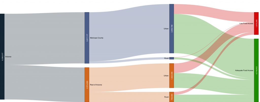 Figure 1: Sankey Diagram visualizing the distribution of Maricopa County’s urban and rural populations’ food access.
While Maricopa County is the largest single county contributor to the low food access population of Arizona, I was curious to see if that was simply because Maricopa was the most populated. Figure 2 displays the percentage of people in each county who live in an area of low food access to see which counties, in particular, are most affected by low food access. Greenlee and Apache counties had the highest percentages of people living in low food access areas at 68% and 61% respectively, while Maricopa County is the lowest at 20%.
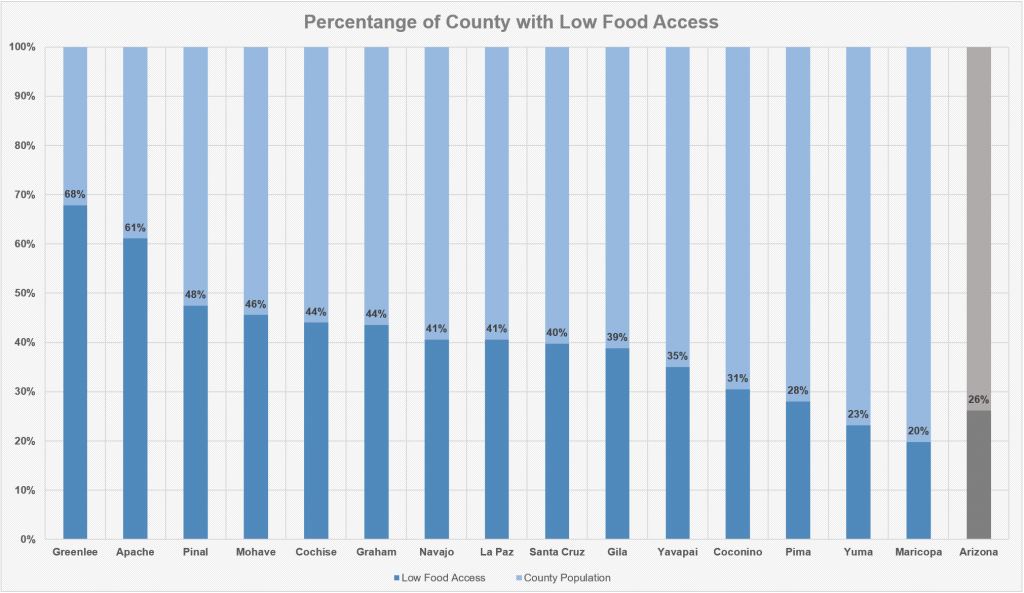
Figure 2: Chart of each county’s population low food access population as percentages of their total county population.
Since the 2010 Census data provided race data by census tract, I was curious to see which races (according to the 2010 US Census race categories) are most affected. Figure 3 shows the percentage of each race living in low food access areas (gray) compared to adequate access (blue) in all of Arizona. The “American Indian or Alaskan Native” race category was the most affected at 43% of the population living in areas of low food access.
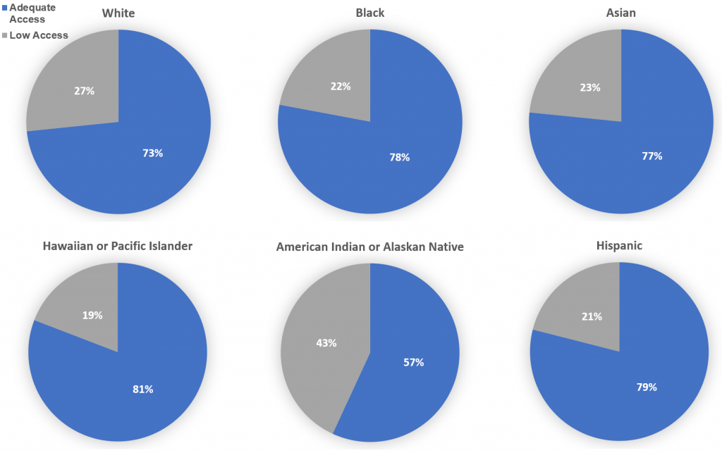
Figure 3: Pie charts indicating proportion of people living in low or adequate food access areas by racial groups (categorized by US 2010 Census).
Finally, I wanted to visualize if there are particular counties where the Native American and Alaskan Native populations are most affected. Figure 4 plots Arizona counties by their Native American and Alaskan population with the percentage of people affected by low food access in the county. Apache county in the upper right corner stands out as a county with the highest proportion of Native Americans and Alaskans, while also being one of the highest affected by low food access.
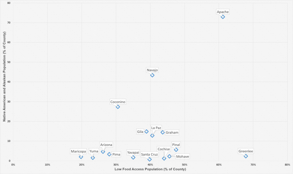
Figure 4: Scatterplot of Arizona counties plotted by the percentage of county population living in low food access and the percentage of the county population that are Native American and Alaskan.
One of the major limitations of this data stems from the fact that it is from 2010 and it is likely that much has changed since then. Another limitation is that the data I shared was geographically based and does not factor income or occupation. Consequently, this data does not account for people who live in areas of adequate access, but cannot afford food from supermarkets, and vice-versa. That being said, I still found it interesting to see what food access looked like in 2010 for Arizona, all of its counties, and specifically for American Indians and Alaskan Native populations.
Economic Research Service (ERS): Food Access Research Atlas. U.S. Department of Agriculture (USDA). Retrieved from: https://www.ers.usda.gov/data-products/food-access-research-atlas/. Accessed on 6 November 2019.
Shivraj Grewal is a medical student at the University of Arizona College of Medicine - Phoenix. He is a Los Angeles native and graduated from the University of Chicago in 2017. After graduating, he worked as a clinical research fellow at the National Institutes of Health for two years where he developed an interest in translational research, health disparities, and data science. In his spare time he enjoys hiking, taking pictures, and collecting records.